2.22.2011

BR Concept Soft & Whimsical Luxury...

This is the second part of the 1-bedroom project in my building in Gramercy.  So the below is my client's bedroom in it's current state.  It's very contemporary with a mod flair.  It has a lot going on but everything feels like it's fighting each other.  There's not a smooth flow between the bedding and wall color and painting and bed frame, etc.   And it's not 100% finished either, it's not a cozy room and a bedroom must be just that.  As you can see there are no window treatments, no rug, everything is pretty dark (furniture, bedding) and very stark (white walls) not to mention there's a awful accent wall! 

So after I met my client she is very fashion forward, has great taste and like I mentioned before just has trouble translating it into her home.  The first couple times I met her she was wearing beautiful dusty purple and mauve hues that reminded me so much of Chloe.  I also know she prefers a modern look with a bit of eclecticism and maybe a hint of vintage.

The picture below is what I began with....pulling some swatches here and there.  It's definitely a process that evolves as you go.  I love layering and don't think anything should be rushed.  If it's rushed, it will end up feeling contrived and store bought, not organic.  I knew she wanted something completely different from her living room so I thought why not make it very lux and girly.


As the inspiration evolved and I've been able to focus on additional items like softscaping here's some more things I pulled...


And here's a more detailed version for the left side of the board...


Here's another picture including a stool I want to incorporate...


And here's a more detailed version of the right side....


 Hope you enjoy...can't wait for it to keep evolving and the paint & wallpaper to be up soon!

2.17.2011

LR Concept: Modern eclecticism

It's about time I start incorporating more projects that I'm working on into my blog so here goes!

I am in the midst of three projects, all at completely different stages.  This one that I'll start with is a 1 bedroom in Gramercy, actually in my same building!  I was hired by a girl who saw the ad I had posted on our building's bulletin board.  I have gotten royally spoiled with the ease of meeting and zero travel time between floors!  I recently revamped her bedroom dresser over a weekend and the time and effort it took to carry paint and tools to and from was a piece of cake in comparison to many others.

Here are some pics of her current place.  She owns her apartment, bought it a few years back and completely gutted it.  She most recently (as of last year) hired an interior designer but it didn't work out so well.  She felt extremely rushed and in turn ended up not being happy with their choices.  This is her final shot to make her place feel chic and liveable...no pressure for me or anything ;).


This white shelving is going to be ripped out and a new wall-to-wall shelving built in it's place.

The dark accent wall will absolutely be changed, you know my feelings on accent walls ;).  The whole room will be painted a great neutral grey.

Lucky for me, this client has great taste!  Every time I've met her, her outfits have been amazing!...like a lot of people, she can dress herself but definitely struggles with dressing her home.  She has very modern taste but appreciates well made objects that age beautifully so there's potential for vintage but in very small ways.  I immediately understood what she likes and we have vibed so well throughout this process.     

This first pic is the overall concept we had for her living room.  A sense of modern eclecticism with a worldly feel since she travels a ton.  We decided on a light grey for the walls and accents of persimmon and a rich luxurious teal here and there to compliment a large painting she has hanging above her sofa.
This is the shelving we decided on to have built from end to end along the right side wall.   Like in the inspiration, we will make this a sitting nook where she can eat, read and even work.
We're planning on a chandelier similar to this style to hang above the small table in this nook (removing the current one).  It will be custom painted in the orange/red persimmon shade.

Then for seating we have decided on this pair of arm chairs.  They will have an aged gold finish and be upholstered in this lux teal velvet like in the bottom chair...


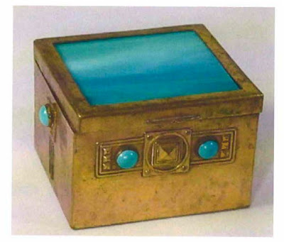
The next few pieces (vases and the decorative box) are all inspiration for decor items, escpeically in order to create a chic, layered and put together presentation on the shelves.


This is inspiration for very worldy/ ethnic/ handmade textiles for the livingroom...

A fun graphic and fuzzy pillow to compliment the colors and add dimension on the grey couch....

This persimmon colored side table will go next to the couch.  The chandelier color will match back to this perfectly.

The below piece we want for her new entertainment unit.  It is from CB2 and I love that it has such an industrial feel and that it's a completely different element we haven't used yet.  It's so good to mix!


I'm sure you'll recognize this rug, I have loved it for quite some time.   I think it'll be a great addition in using greys to ground the room against the other bright colors.
 
That's all for now...but stay tuned for the bedroom in a whole new inspiration-board format!


2.15.2011

Indoor Gardening

My Vday wish came true to do some flower arranging this weekend!  I actually ended up taking an indoor gardening class a local West Elm store offered.  

The presentation featured WE's new line of vases perfect for air, water, dry & cut flowers which showed New Yorker's how easily they could keep plants alive in their otherwise tricky apartments.  My design-bestie couldn't attend because she's out of town so James was a trooper and joined me.  We got front row seats... 

They showed us a couple different ways to make arrangements and then asked for some volunteers to try their own.  James immediately grabbed my arm and put it up and of course I got picked!  This picture was taken right after I went up...total deer in headlights look, haha!  I was a little nervous in front of a crowd of people!  Now I understand what the sham-wow guy must have gone through ;)

It was so much fun and each volunteer got to choose the vase we wanted to work with.  I used the sculptural multi vase on the right (below).  It has separate vessels- which was so cool!  It was from a new collection WE offers called the Shane Powers' neolithic collection.  I mentioned in another post how WE is doing such an amazing job with all their partnerships with artists, this one especially!  Shane is an interior designer/ prop stylist/ craftsmen/ set designer.  Seriously, how many amazing titles can 1 person have?!  He's worked on styling magazine shoots such as Vogue Living Australia.  So legit!  I also got the small little pot in the middle as a gift afterwards for volunteering- thanks James! :)


Here's some more of Shane Powers collections for West Elm...

This one is called the Water Lilies collection because the lipped edges resemble water lilies.  These are excellent for creating under water arrangements with more structured plants & flowers (orchids, eucalyptus, tulips all work well).


These cylinders are part of the cut clay collection.  They are great displayed on their own or stacked one within the other creating a staggered, architecturally pleasing foundation perfect for rocks, sand, dried flowers, cacti and other succulents.  They recommended stacking rocks or layering sand in the bottom of vases in order to secure any flowers.


I've also seen under water arrangement anchored by using decorative wire and wrapping it around the flower stem and then also around the rock so that it acts as a weight.  I'm going to try and recreate these soon!

They gave all the people who attended the class their own air plants to take home, which you can also buy in the store now.  

Air plants are a piece of cake to take care of too...all they need is a little light and a little water, literally you just have to spritz them twice a week.  If you don't have a green-thumb, these are most definitely the plants for you!

I really love that furniture & home decor stores are starting to incorporate plants and flowers.  West Elm also offers the dried flowers you see above so you can buy everything in one swoop and easily make your own arrangement at home.  Here's what I did with the plants we got...


And then I noticed the store was throwing out a small woven bag (that are used to hold the decorative rocks they sell) and some Eucalyptus from the presentation and so I asked to take home and ended up making this little arrangement...

 I had such a great morning in this class and love getting new ideas.  If you'd like to try making your own or see additional tips, here's a little 'how to video' by Shane Powers himself.  

2.11.2011

A little Oooo La La...

In preparation of Valentine's Day I wanted to share some fun, romantic, inspiring rooms and floral arrangements...

This was my favorite image I found.  1. The mirror is insane!  2. The bed is insane!  3. The elf slippers are insane! :)  I love the layout of the room, especially how the bed is floating in the middle, it is so different!

I haven't been a fan of pink since I grew out of my childhood bedroom that was all pink but this is a really nice way to use it in a small/ subtle way...

Just because it's Vday doesn't mean everything has to be pink and red and covered in hearts ;).  This is super soft and romantic in a beautiful Parisian shade of blue.

1. The beamed/ pitched ceiling in the place is to-die for  2. The wallpaper although so busy and dainty works beautifully with all the rustic furniture and vintage-looking striped rug.  I love when patterns in the same colored family are mixed (stripes & florals).  I also love the mirror between the two windows anchoring the wrought iron bed and the beautiful jug of blooiming cherry blossom branches.  They make a huge impact!

Again here- stripes & florals....

This last photo is great because it's so unexpected.  Putting so many different colors and genres of furntiutre together in one room but it really works and is super playful.  I love the electric yellow.  And the ombre-feel paint job on the wall is amazing. 

I love how stark these white vases are against the dark dresser & mirror and how delicate the flowers are with hints of white to compliment the vase.

Now on to some more pretty things thanks to mother nature...

I can't even fully express my immense love for these super romantic and unique bouquets from from Sarah Ryhanen, owner of Saipua, the cutest flower shop & blog who also even runs the little flower school in Brooklyn.  I've got to look into their classes! 

See how their arrangements are full of whimsy and some even cascade over the side ever so delicately.  I always try to achieve this and never quite manage to nail it.  The color and texture compositions all are amazing and perfectly muffled. 


I'm hoping maybe James and I can go flower shopping this weekend so I can create one of my own whimsical arangements....hint hint if you're reading this, babe ;).

Some news to share before I end...I'm starting a new job at an architecture firm that does interior design too.  I start on Monday and couldn't be more excited!  Hoping this is the "foot-in-the-door" experience I've been searching for.  Wish me luck! 

Have a great weekend!
OXOX!